Generally, there are millions of people who use their mobile devices more than their desktop computers. In the last quarter of 2014, mobile search volume rose to 120% from the same period in the previous year.
Heads up to all website owners and developers! To intensify user experience, Google decided and announced that on April 21, 2015, all websites must be updated to become mobile-friendly sites. Any web design company in the Philippines must comply with this, or else Google may penalize sites that will not be. Such a gigantic leap in digital marketing doesn’t only impact the web owners themselves, but more the users now that digital usage is becoming more mobile-first.

What mobile-friendly means
On April 21st, Google will start labeling and identifying websites that are already mobile-optimized. If you passed Google’s mobile-friendliness test, chances are, the search giant will increase your website’s ranking in the mobile searches. Congratulations! Google has just rewarded you for updating. If your site is not yet mobile-friendly, you still have a few days to convert it into one.
So, what is a mobile-friendly website anyway? Well, it means all important features and elements of a website is viewable on various mobile devices. Each feature functions differently depending on the device that is used in browsing. The same goes with the layout that must look nicely fit on any devices as well – be it on smartphones or tablets. Thus, the desktop version of your website must scale and respond to the specs of a mobile device before you can call it mobile-friendly. In this way, mobile users may access your site easily and quickly.
The impact of a mobile-friendly website to SEO
Undeniably, such an update will dramatically change the digital marketing landscape not just on the website level alone. Every aspect will be affected, and SEO will not be an exemption. This applies in particular because Google blatantly emphasized the reward to becoming mobile-responsive – better mobile search results.
Basically, a mobile-friendly website can be personalized as well in terms of contents, calls to actions and other elements. The goal is to make it accessible, so the visitors will engage more deeply with your website.
Mobile SEO, anyone?
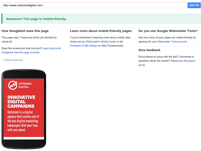
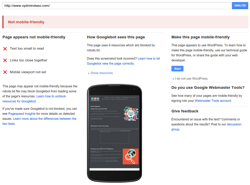
How to know your site passes the mobile-friendly standards
Passing Google’s standards is easy, that is, if you know if your website is mobile-friendly or not to begin with. You can test your website’s mobile-friendliness that Google also provides. Testing is free. You simply need to supply your URL on the field. Click ‘Analyze’ and from there, you will know whether your site has a mobile-friendly design or not. While the testing tool can only say if your website is mobile-friendly or not, it will tell you the reasons Google deemed your website as not mobile-friendly, for instance. If it is not, it will offer suggestions on how to make your site mobile-friendly. You can also check Google Webmaster Tools to determine the mobile usability of your website.
While the testing tool can only say if your site is mobile-friendly or not, it will tell you the reasons Google deemed your website as not mobile-friendly, for instance. If it is not, it will offer suggestions on how to make your site mobile-friendly. You can also check Google Webmaster Tools to determine the mobile usability of your website.
What you must do if your website is not mobile-friendly
For non-mobile-friendly websites, you have to apply some adjustments. These could be minor, major changes or both, depending on the mobile-readiness of your site. From the layout to the elements, you have to be attentive to every detail of your website to make it mobile-friendly.
For instance, you may add a meta tag (<meta name=”viewport” content=”width=device-width, initial-scale=1.0″>) to signal browsers that your website adapts to various devices. Google also publishes other responsive web design configuration guidelines.
Websites who can’t update within April 21st
For those sites who can’t the reach the deadline, fret not. Google’s algorithm acts in real time, which means, it will still accept updates beyond the given deadline. Google only said that there would be rewards, but no punishments. However, the fact remains that your website will be on the losing end wherein your spot on the search engine results pages (SERPs) will be awarded to mobile-friendly websites.
Any wise digital marketer would be doing a disservice to your own website and thus, brand, products, and users. A lost opportunity on your end will be another site’s gain.
Applying the mobile-friendly update on your site gives you the benefit of extending your niche in the mobile landscape. Not to mention, the other benefits that Google mentioned. However, this might require a few meetings with your web designers and developers if your site is not yet mobile-friendly. The premise is either you adapt to the changes, or you lag behind the competition. The ball’s on your court.
Image credit: Search Engine Land


