Developers know it – the struggle of designing an interaction is real. The process is multi-faceted and involves more than just meticulous planning. Making the matter worse, more and more interaction design technologies and patterns are emerging it is so confusing which ones to use for the hard-to-impress users. Nonetheless, becoming aware of the commonly committed mistakes is the first step to avoiding committing them. Here are these design mistakes.
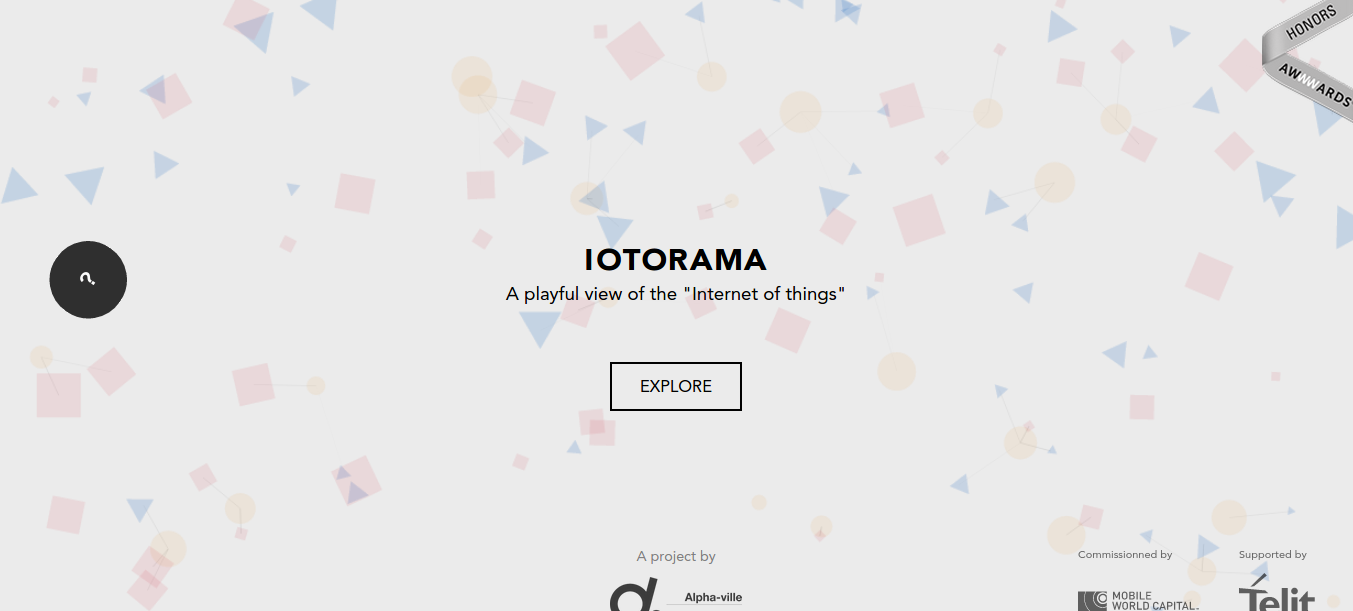
1) Overwhelming innovation
We get it – designers and developers are very creative people. However, it takes serious consideration of what interaction design (IxD) to put into a particular website otherwise it won’t be as interactive as it should be. Remember that a user craves for the familiarity of both design and navigation. Also, a user bails fast if he or she finds your site overwhelming enough to leave.
Here is an example of a too innovative a site. The site is fantastic, but there are so many things going on. It is not intuitive, leaving the users wondering what to do.
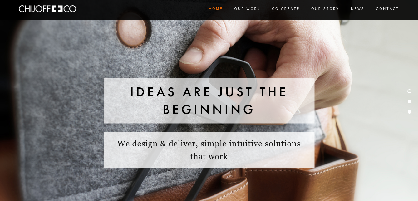
2) Confusing navigation
And innovative as they are, some developers even came up with not-so-ordinary names for the site’s pages without realizing its relevance. Such a practice is very effective in confusing the users. By not showing them what to expect from the site and what they should do while exploring it, you are telling them to get out of the site quick. Don’t do that.
Here’s a perfect example of a not so navigation-friendly website. There is some value to the site and what it wants to do. However, it failed at having clear calls to action in a big way.
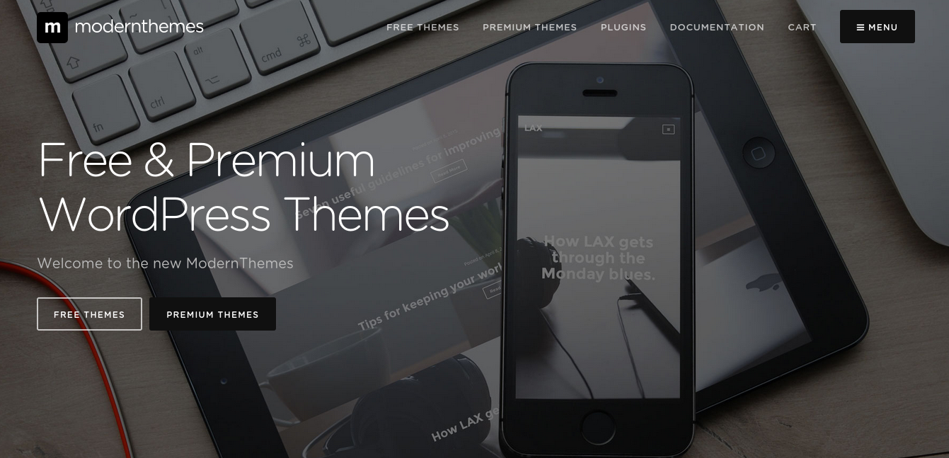
3) Blurring contrast
Unfortunately, developers are aware of the virtue of using contrast, but some are awful at implementing such. Without clear contrast, it would be hard to establish visual hierarchy. In IxD, it is all about the right combination of colors, sizes, shapes and positions so that the site will succeed at drawing the user’s attention to the most important elements of the site.
Here is another poor example of a site with blurry contrast to think that this site is offering free and premium WordPress themes. It uses black and white and yet its background image is gray, drawing prominence away from the calls to action.
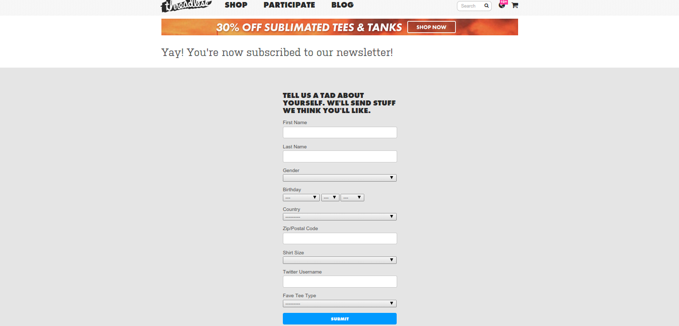
4) Neglecting form
Form style and design are basic to IxD. However, although the developers are not to be blamed for this, some website owners still ask for too much information from their users. This bores the users and is a good motivation so the user leave your site. Again, we all know that a website always has a purpose including generating leads. However, if you are going to utilize the default form, don’t expect that your users will easily and willingly signup.
Here is an example of a site that asks a lot from its users including their Twitter names. While it is good to ask, still, there is no clear reason why the site is asking for such.
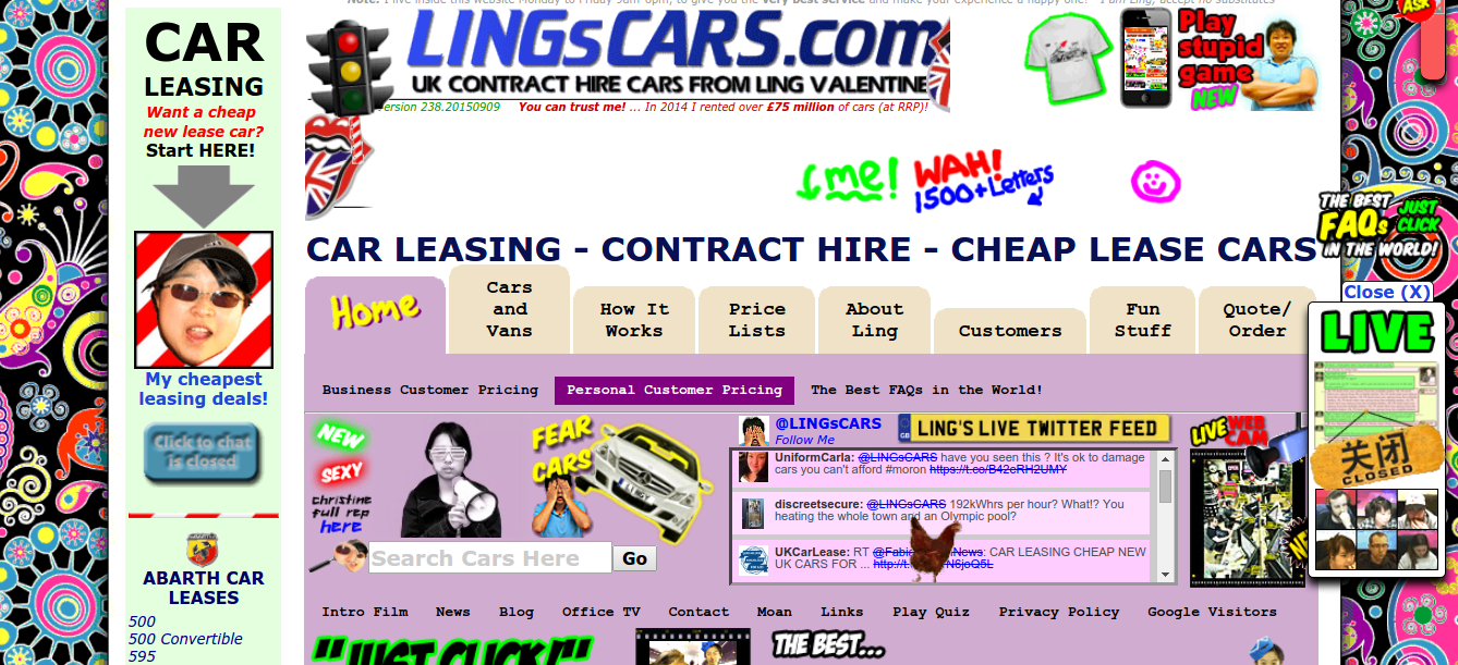
5) Unappealing clutter
All of these are considered ‘noise’ that ruins the momentum and makes them very unappealing at the aesthetic and experience level. These can be considered as clutters aside from the actual clutter, that is. These websites tend to have a busy above-the-fold that borders confusing and annoying.
An example of a cluttered website is the below. In fact, this website was featured as one of the World’s Worst Websites, and for good reasons.
Web designers and developers, listen. As a final advice, don’t forget to test until you reach the optimal design for your website. Testing should not constrain your creativity because, in the first place, you are designing a website with the users in mind, right? Such a cliché but this cliché holds true today and, perhaps, for all the days to come.


