In a world that is swiftly taken by the ongoing mobile revolution, it is no longer a question whether to go responsive or not. Responsiveness is an absolute must especially since we are entering the mobile-first phase. With this in mind, it is a must to optimize the landing pages for mobile consumption with the most impact on the role of the mobile application developer Philippines. Nevertheless, the process is not as difficult as one may think.
Here are some simple ways to do so.

Scale appropriately
Websites can scale to different devices. However, screen sizes generally differ, so it is only appropriate to make the site viewable on multi-screens. Adaptive web design is acceptable.
Just make sure that the site scales properly for both portrait and landscape.
Reduce page load time estimably
Landing pages should load quickly. While there are no hard rules, the standard is the faster the loading time, the better. It should be between 2 and 4 seconds. Anything beyond that will annoy your user. Make the page extremely lightweight, about 20 kilobytes.
Aside from keeping code nice, consider using image sprites and CSS.
Publish content prudently
Due to less space available, headlines should be short, direct and concise. The entire content should be clutter-free as well with only an image and few links. There should be a clear and strong call to action (CTA). Remember that around 75% of mobile searchers take action within an hour. Put the CTA where the user can easily see it.
As much as possible, create contents in digestible chunks. Listicles and bullet points are the best as they can be read in one sitting.
Make contents highly readable
Less is more for mobile consumption since being able to grasp every word on the screen is important. Use straightforward fonts. Make fonts bigger than usual.
Furthermore, don’t make the users scroll endlessly. They will get bored then, move on to the next.
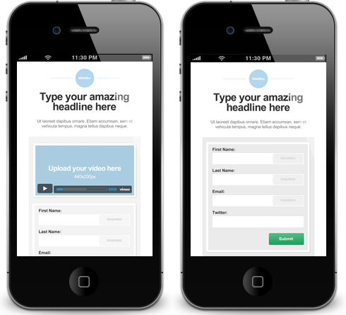
Check forms and inputting meticulously
Keep forms on landing pages simple and accessible. Forms should be accomplishable in a minute or less. Few fields will do, otherwise the user will abandon the landing page because it is draggy.
Conduct the thumb test initially
Clickables should be tested, and they should pass a thumb test. Remove anything that cannot be easily clicked using your thumb. Pad the links so there should be adequate space around these links. Proper spacing between the links should be apparent as well, so users can tap the right link.
For a gallery-type landing page, make sure the photos can be easily swiped.

Ensure simple navigation
Navigation must be straightforward. Buttons should be minimum in number and should be scattered logically on various parts of the page.
Actions must be also kept to a minimum. In the mobile industry, more actions could mean the less desirability of completing them. Remember the three-click rule? Getting from points A to B should be simple enough the user will be encouraged to stay in the page.
Target locally
Mobile users are up and about. Tailor the page so it will be relevant to the local target market Alternatively, you may customize the content to reflect the local operation such as the nearest branch or store to the user.
Consider adapting core contents to the location of your target audience.
There are just some of the most important things to think about in optimizing mobile landing pages. The obvious fact is that mobile and desktop are two very different mediums. Nonetheless, mobile users are more impatient than PC users. Hence, it is critical to design a landing page with the users in mind. This could spell the difference between gaining and losing visitors and therefore leads and conversions.


